Good design simplifies our lives, which is why it’s crucial for designers to empathize with users when creating products or spaces. Whether designing playgrounds or office buildings, it’s important to consider the diverse needs of various groups, including people with disabilities, seniors, and children. While this can be challenging, some designers excel in creating solutions that truly meet these needs.
In this collection, we’ve highlighted outstanding examples of designs that cater specifically to children. From innovations that assist parents in managing their little ones to solutions that benefit kids directly, these designs demonstrate thoughtful consideration of their users. The range of concepts includes everything from small doors for kids to engaging play areas at the dentist’s office.
To gain further insight into the impact of good design, Tinytotsblog consulted Dak Kopec, an architectural psychologist and professor at the School of Architecture at the University of Nevada, Las Vegas. His expert perspective on what makes effective design will be shared below.
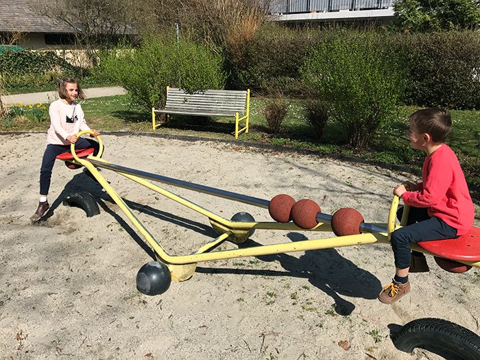
1 This See-Saw Has Sliding Weights So Different-Sized Kids Could Play Together
2 A Test Of Maturity
3 This Playground Has A Sign So Hearing And Deaf Kids Could Play Together

It’s not easy to find a universal definition of what good design is. It’s a complex matter that involves creativity, anticipating and understanding the end-user’s needs, and so much more. Yet, oftentimes, people recognize a good design when they see one intuitively.
That is because such design is typically expected to tick two main boxes—functionality and aesthetics. An item has to serve a purpose, however, it has to be visually appealing as well, which is why it’s important to find that middle ground. When the designer reaches this goal, it automatically positively reflects in the user’s experience.
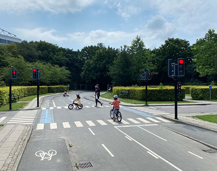
4 Miniature Traffic Playground In Copenhagen Where Kids Learn To Bike In Traffic
5 My Husband Built This Indoor Playhouse For Our Foster Children, Complete With A Kitchen, Real Working Windows, And Lights

A set of requirements for what a good design should be was presented by Dieter Rams, a renowned German designer who spent decades working with the consumer products company Braun and the furniture company Vitsœ.
Back in the late 1970s, he asked himself the question “is my design good design?” and came up with 10 principles for good design that are equally relevant to this day. The first thing he emphasized was that it has to be innovative. The constant technological advancements provide an abundance of opportunities for innovation, which is why it’s important to try and keep up.
6 My Car Wash Has A Soap Cannon For Kids

7 I Saw A Special Swing For Wheelchair-Bound Children

8 These Kids Toilets In A London Museum. Whose Sinks Slope To Cater For Progressively Shorter Children
Second on the list was usefulness, which is what you get after combining functionality with certain psychological functions and aesthetics. Rams suggested that good design accentuates the usefulness of a product by relinquishing anything that does not serve its purpose.
He continued to emphasize the importance of aesthetics itself, as well as noting that good design makes a product understandable. In addition to that, it has to be unobtrusive, as functional products are not decorative objects, nor works of art, which is why they should be quite neutral.

9 This Park Has A Swing Where A Parent And A Kid Can Swing At The Same Time

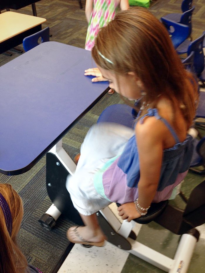
10 My Daughter’s First Grade Classroom Has Desks With Pedals So Kids Can Move While Learning
 Anyone can write on Tinytotsblog. Start writing!
